CHAPTER 7
Alternative Independent VariablesIn this chapter I review a number of studies in which we used an independent variable other than population density, a geographic unit's population divided by its area.Seattle Police Department Early in 1973 a Sociology graduate student, Greg Hall, hoped to do his M.A. thesis on something related to his planned career in police work, preferably a study of crime in Seattle. I have no background in criminology, and those who taught the subject in our department at the time were not very supportive of students going on in police work. I became interested in Greg's project when he showed me how the Seattle Police Department had divided the city into the "sectors" shown in Fig. 7-1. Sectors were composed of census tracts, which meant that we could easily obtain population and area figures (Table 7- 1). Would sectors conform to the size-density hypothesis?
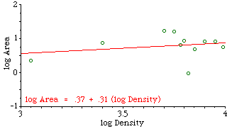
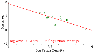
Fig. 7-2 shows that they did not. The slope was positive, though not significantly so. A possible explanation occurred to us: The units studied previously were, in one way or another, units of general government. The government of a territorial unit affects all its inhabitants to some degree. Police do not interact with all the inhabitants of sectors; presumably, they interact with reported crimes. Maybe, instead of density, we should see of sector size was related to crime density. We obtained six months' worth of crime data from the Operations Analysis Unit of the SPD. Crimes were those the SPD classified as "patrolable" (e.g. burglary, robbery, auto theft, car prowl, morals) as opposed to those considered "private" (e.g., embezzlement, family disputes).
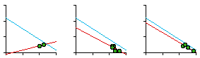
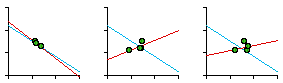
The slope was negative, departing significantly from zero (p < .005), and it did not depart significantly from the -2/3 value. Interestingly, the sector which departed most from the regression line, the second smallest unit, was King sector, an area heavily patrolled for morals offenses. Relative to the other sectors, this one seems "over-administered", with a smaller sector than the crime density would justify. When we asked department members why the boundaries were drawn as they were we got a mixed rationale of intuition and experience: traditional neighborhoods, access routes, land use differences, etc. No mention of crime or crime densities. In fact, with a slope of very nearly -1.0, they had apparently unwittingly created boundaries which virtually equalized the number of crimes from one sector to another. The next surprise came when we discovered that data were also collected for an operational level below the sector. Each sector contained "car patrol districts", the number of which varied by "watch", as shown in Fig. 7-4. How would these districts relate to crime density?
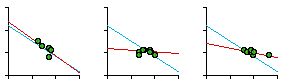
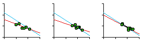
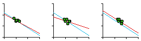
Fig. 7-5 shows the regression statistics for car patrol districts by sector and by watch. As can be seen, not every slope is negative (so negativity isn't merely tautological, the result of how we define "density"). It is also worth noting that apparent departures from the size-density relation may not be as important as the computed statistics might suggest. In most cases, even those sectors with positive slopes, the dots cluster fairly closely along the city-wide blue line shown with each plot. The slope for the city-wide line, by the way, was -0.67 or exactly -2/3.
What was intriguing about this study was the fact that the district boundaries shifted three times a day, apparently in response to changes in the crime density patterns during the day. This seemed an intriguing confirmation of the size-density hypothesis: boundaries chasing densities around town during the course of a day. Greg completed his thesis[1] during the Summer of 1973, and I wrote a paper reporting the results for possible publication. The paper was rejected by the American Journal of Sociology, the Pacific Sociological Review, Sociology and Social Research, and the Administrative Science Quarterly. The most frequent complaint was that all this was already known to police (it wasn't common knowledge at the SPD Operations Analysis Unit) and to sociologists (?). I gave up trying to publish it sometime in 1976. Honolulu Police Department
In January of 1976 I received the results of a study of the size of police beats in Honolulu, Hawaii, from David Swanson.[2] Dave had been an undergraduate at Western in my earliest days there, my first really notable student in fact. Within metropolitan Honolulu there were 75 police beats, the geographically smallest unit in the system. Beats represented the area of responsibility for one police officer. Beat size did not vary by watch. Regressed against the log of 1970 population density, the log of beat size produced a slope of -0.54. Against crime density (total FBI indexed crimes) the slope was -0.79. Against calls-for-service density (major and minor offenses and non-offenses) the slope was -0.79 . These results were in accord with Hall's. Catholic and Episcopal Diocesan Boundaries
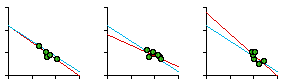
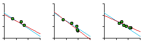
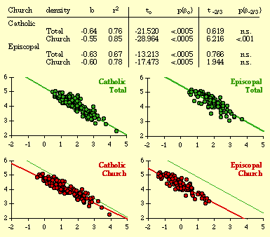
Near the end of 1974 Glen Suggs, a graduate student in Sociology, wanted to develop a thesis having something to do with religion. As with Greg Hall's interest in police work, my colleagues were not very friendly toward religious studies. Neither was I, actually, but I suggested testing the size-density hypothesis on parish or diocesan boundaries where such data might be available (many churches are purely congregational and so lack any geographic definition). He originally selected the Roman Catholic, Episcopalian, Methodist and Presbyterian churches for study but dropped the Methodist and Presbyterian because he couldn't obtain sufficient data. The Roman Catholic Church divided the United States into nine provinces, each containing eight to fourteen dioceses.[3] The Episcopal Church divided the United States into eight provinces, each containing seven to fifteen dioceses.[4] The results of the analysis are shown in Table 7-2 and Fig. 7-6. In all cases, the slope is negative. In only one of the four studies does the slope depart from the -2/3 value. In the case of both religions, the correlation coefficient is greater for denominational density than it is for total population density, suggesting "fine tuning" of boundaries to the relevant specific population.
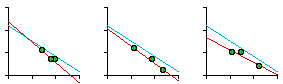
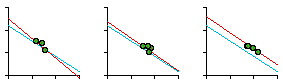
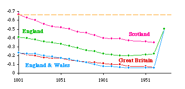
England: Historical and Regional Density Doug Massey was an undergraduate, completing majors in Spanish, Psychology and Sociology when I met him in October, 1973. He showed up at my office saying that he wanted to learn something about Demography. Either because I did not regard that as my area, or because I was busy at the moment, I just said "read Bogue"[5], and Doug left. The following January he returned to announce he had read Bogue and to ask What next? I said "You probably know more Demography than I do. Want to do some research?" I had been bothered by the fact that the United Kingdom failed to provide any support for the size-density hypothesis. As shown in Table 5-1, the 101 counties of the United Kingdom produced a slope of -0.09, a slope not significantly different from zero. Table 5-2 showed that the slope departs significantly from the -2/3 slope of the world as a whole (p < .001). I had earlier speculated[6] that In ... the United Kingdom it may be that boundaries which once reflected the population distribution have been maintained despite later population shifts.Testing this notion would require historical data, of course. Doug found a source[7] giving county populations from the earliest census (1801) to most recent. What made this source particularly valuable was that figures were reported as adjusted for minor boundary changes throughout the period, so we were able to use the same area figures throughout. We did not include the six counties of Northern Ireland in the study because no comparable data set could be found and because they constituted a separate land mass. We were thus studying Great Britain (England, Wales and Scotland), not the United Kingdom. The results of our analysis are shown in the left-side columns of Table 7-3 and in Figure 7-7. The last two columns of Table 7-3 ("regional") will be explained below.
As is evident, the slope becomes more negative the earlier the census year. This tends to support the earlier speculation, though it is technically inappropriate to extrapolate historically beyond the period for which we have real data. But these results are compatible, at least, with the idea that before the Industrial Revolution there may have been a size-density relation in the United Kingdom. If the boundaries remained fixed (which is certainly true in general terms) while the population shifted, whatever relation may have existed would tend erode toward zero. When we began this research we had no idea that the structure of local government was undergoing profound revision. Doug discovered this after his arrival in the doctoral program at Princeton, in the Fall of 1975. Local government had been reorganized in Greater London in 1965, in the rest of England and Wales in 1974, and in Scotland in 1975. Ancient counties were replaced, for governmental purposes, with new administrative counties. Would these show a size-density relation? We could only obtain data (estimates for 1973)[9] for England and Wales (Scotland had replaced its counties with 9 regional and 53 district authorities). The new slope for England was -0. 50 and that for England & Wales combined was -0. 49. These new values are plotted in Fig. 7-7. Clearly, they show a return toward a negative slope, though they were not within the confidence interval for -2/3 (the dashed orange line in the figure). We wrote our findings in a paper and submitted it to the American Sociological Review (that was where the original article had been published). They rejected it (June, 1976) with several odd comments. First, they noted that Wales (which we had not computed separately) must have really been deviant since England & Wales combined was so near zero, as if the regression slope for the pooled data should act like an average of the sets taken separately! Second, the size-density relation was tautological, true by definition (area is the dependent variable and the denominator of the independent variable). The whole point of the study was to account for the fact that the relation had not held empirically in the 1972 study. How can something which is true by definition be false in fact? We wrote a lengthy rebuttal which got us nowhere. The paper was finally published in Demography. [10]
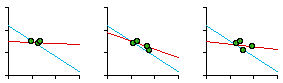
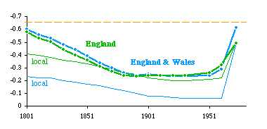
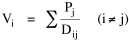
Partly in response to the tautology concern, I returned to the topic of county size in England in a later study, conducted with Lucky Tedrow and Doug Massey. In all earlier studies the density variable had been "local" — a territorial unit's population (or crimes, or religious adherents) divided by its own area. Yet what theorizing had been done so far implied that regions of high density tended to become further subdivided. Ordinarily there would be no problem with using "local density" as a proxy for "regional density", since a unit's density will tend to be like those immediately adjoining, but why not compute such a regional density directly? We did so. For each county, we added the populations of all the contiguous counties to obtain a regional population. We obtained a regional area by summing contiguous county areas. Regional density was then the regional population divided by the regional area, D = Σp / Σa. Local county area was clearly not identical to the denominator of regional density. The results[11] are shown in 7-8. They follow the pattern obtained earlier, approaching the -2/3 value historically and after reorganization. In fact the regional slopes are within the 95- percent confidence interval for 1801 and in 1973 for England and Wales combined.
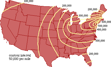
Population Potential In a related attempt to sidestep the charge of tautology, around the Fall of 1975, I took up the earlier suggestion of using "population potential"[12] in place of density as the independent variable. I began with a map showing population potentials in 1940[13], from which Fig. 7-9 is adapted.
As a rough preliminary study I placed states in the population potential category within which the state capital was located. Then, from the table of county sizes (Table 1-1) I distributed county sizes among population potential categories. The result was the cross-tabulation shown in Table 7-4. The table suggested a size-potential relation, and ordinal measures of association[14] confirmed it.
On the strength of these results I decided to go further. I had earlier, around 1972, produced a set of computer cards containing the latitude and longitude of every county seat in the United States[15] and their dates of creation[16] Lucky Tedrow used this set to generate 1970 population potentials for each county. I obtained a random sample of 100 counties (with their potentials) from him. While all this was being assembled, I developed the following argument. Stewart and Warntz[17], basing their results on a study of rural counties in England and Wales, found that rural density was proportional to the square of population potential, thus where D is rural density and V is population potential. My most general finding so far was that area was proportional to density raised to the negative -2/3 power, the antilog form of the "world regression line": If most of the 1,764 territorial units comprising the world regression line were rural (which seemed reasonable to assume), then it should follow algebraically that area is proportional to potential raised to the negative four-thirds power Further, since D = P/A, the rural population should be proportional to potential raised to the two-thirds power
I did not expect Eq. 2 to be confirmed (the size-density relation for counties had eroded) and it was not (p < . 01). The other results did not differ significantly from those hypothesized, though the correlation coefficients were rather low. I never did publish these results, nor do I remember which journals I sent the paper to. One objected that the paper was too mathematical and not sufficiently theoretical, which assumes a contradiction between these adjectives unknown outside Sociology. Another said my sample was too small, overlooking the point of statistical sampling in the first place. I quit sending the paper out sometime in 1979.
NOTES: [1] Greg Hall, "Administrative Areas of the Seattle Police Department: an Application of the Size-Density Hypothesis," unpublished M.A. thesis, Department of Sociology, Western Washington University, 1973. [2] He conducted it with Gary Sakihara of the Sociology Department, University of Hawaii, and Michael Meyer of the Honolulu Police Department. It has not been published. [3] Area, total and Catholic population data were obtained from Thomas Walsh, The Official Catholic Directory, New York: P. J. Kenedy, 1970. [4] Denominational population data came from Allen E. Kelly, The Episcopal Church Annual, New York: Morehouse-Barlow, 1970. A map showing diocesan boundaries showed what counties comprised each, and this enabled us to obtain the area and population data from census materials. [5] I was referring to Donald J. Bogue, Principles of Demography, New York: Wiley and Sons, Inc., 1969 [6] G. Edward Stephan, "International Tests of the Size-Density Hypothesis," American Sociological Review, 37:367, 1972. [7] B. R. Mitchell and P. Deane, Abstract of British Historical Statistics, Cambridge: Cambridge University Press, 1962 and 1971. [8] There was no census in 1941. [9] J. Whitaker, Whitaker's Almanac, London: J. Whitaker, 1976. [10] Douglas S. Massey and G. Edward Stephan, "The Size-Density Hypothesis in Great Britain: Analysis of a Deviant Case," Demography, 14:351-61, 1977. [11] published as Douglas S. Massey, Lucky M. Tedrow and G. Edward Stephan, "Regional Population Density and County Size: A Note on the Problem of Tautology in Size-Density Relationships", Geographical Analysis, 12:184-188, 1980. [12] Population potential: The procedure assumes a set of k places (e.g., county seats). The population potential at place i is where the numerator is the population at place j (e.g., the population of county j) and the denominator is the distance between place i and j. See Henry S. Shryock and Jacob S. Siegel, The Materials and Methods of Demography (revised printing), 162, Washington, D.C.: Bureau of the Census, 1975. [13] ibid., 144 [14] ordinal association: Cells above and to the right of a given cell are "concordant" (i.e., they would contribute to a positive relation in regression). Multiply the frequency of each cell by the sum of its concordant frequencies; let C = the total of these concordant pairs. Cells below and to the right of a given cell are "discordant" (i.e., they would contribute to a negative relation in regression). Multiply the frequency of each cell by the sum of its discordant frequencies; let D = the total of these discordant pairs. Various measures may be computed. One, which ignores ties (same row or same column as reference cell), is gamma: which equals -0.67 for Table 7-5. Another measure, which includes pairs tied on Y, is Somers' asymmetric d: which equals -0.50 for Table 7-5. See, e.g., Hubert M. Blalock, Jr., Social Statistics (rev. 2nd ed.), 439-43 New York: McGraw-Hill Book Company, 1979 for a description of these and related measures). [15] These were determined (primarily from gazetteers, several from maps) by Bill Gossman, a computer science undergraduate and the son of my colleague Charles Gossman. [16] from Joseph Nathan Kane, The American Counties (rev. ed.), New York: Scarecrow Press, 1962. [17] John Q. Stewart and William Warntz, "Physics of Population Distribution," Journal of Regional Science, 1:90-123, 1958 | |||||||||||||||||||||||||||||||||||||||||||||||||||||||||||||||||||||||||||||||||||||||||||||||||||||||||||||||||||||||||||||||||||||||||||||||||||||||||||||||||||||||||||||||||||||||||||||||||||||||||||||||||||||||||||||||||||||||||||||||||||||||||||||||||||||||||||||||||||||||||||||||||||||||||||||||||||||||||||||||||||||||||||||||||||||||||||||||||||||||||||||||||||||||||||||||||