CHAPTER 5
The Size-Density Hypothesis
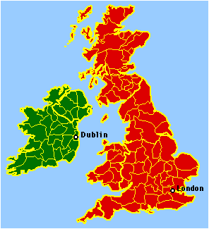
The next phase of the research was less pre-planned than the work I had done so far. After arriving at Western Washington University, I was browsing through a world atlas[1] when I began to wonder about the administrative divisions of some of the nations shown there. Would the model developed to account for size variation in U.S. counties have anything to say, for example, about variation in county size in the British Isles? What about the départements of France? The provincias of Spain? I couldn't approach such a problem directly because I didn't have the kinds of historical maps used in the case of the United States, Figs. 4-1 and 4-2. Still, some aspects of a map like Fig. 5-1 were suggestive. Ireland was originally divided into counties in 1167 when Henry II established English courts at Dublin. There is a rough size- distance relation, county size increasing with distance from Dublin. Northern Ireland, which only separated from the remainder in 1922, became more heavily populated with modern industrialization, but the presence of a size-distance relation suggests that Ireland may once have fit the historical U.S. pattern.
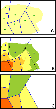
A similar observation can be made for England and Wales. The English counties emerged gradually from ancient kingdoms. Those of Wales were created shortly after 1284 when Edward I placed Wales under the English crown. Again, it is apparent that there is a size-distance relation for the region as a whole, with London as its focus, larger counties to the north and southwest. In Scotland, where "sheriffdoms" were established in the 12th century, the determining factor is clearly geography; the lightly settled highlands contain much larger counties than the more intensely settled lowland region. The difficulty is already apparent. Testing the model on other nations requires information which may be lost in pre-history. Even in the cases just mentioned, there is not sufficient demographic and cartographic information to answer whether county division in the British Isles was in any sense similar to county division in the United States. I had to develop an alternative approach — something other than the historical- geographic — if I wanted to study administrative divisions of other nations. I asked myself what data available today would enable me to test the model developed in Chapter 3? If a long-term process of subdivision had produced administrative boundaries, what relationships would I expect to observe at present? The size-distance relation would be one such finding, but it need not show up elsewhere. It had, after all, disappeared in areas of the United States fully settled prior to the introduction of the automobile. If one or more seats of power had once been the focus of size-distance relations, and these had all been brought together in a larger territorial unit, what would one expect to see at present? In general, it seemed to me, regions which had already been intensely settled should continue to add to their settlement intensity. Regions more lightly settled in the past should still be relatively lightly settled. This was what I later came to call the "size-density hypothesis" — smaller units should show up in regions of higher population density, with larger units in regions of lower density. The relation between the new hypothesis and the old is shown in Fig. 5- 2. Fig. 5-2-A is the same as Fig. 3-8-I, representing expansion of the settlement area from the original settlement area (lower left hand corner). There appears to be a size-distance relation since the partially settled units are not yet fully subdivided. Assuming that older areas continue to grow, their densities would increase over time, whether or not subdivision had gone to completion. If this were the case, the result would be as shown in Fig. 5-2-B, with yellow-orange shades indicating higher density. Fig 5-2-C is what we would expect if we computed densities directly from data obtained from modern territories (density = population/area).
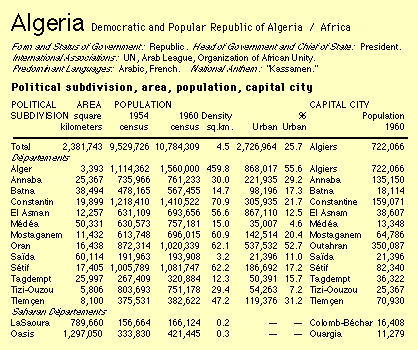
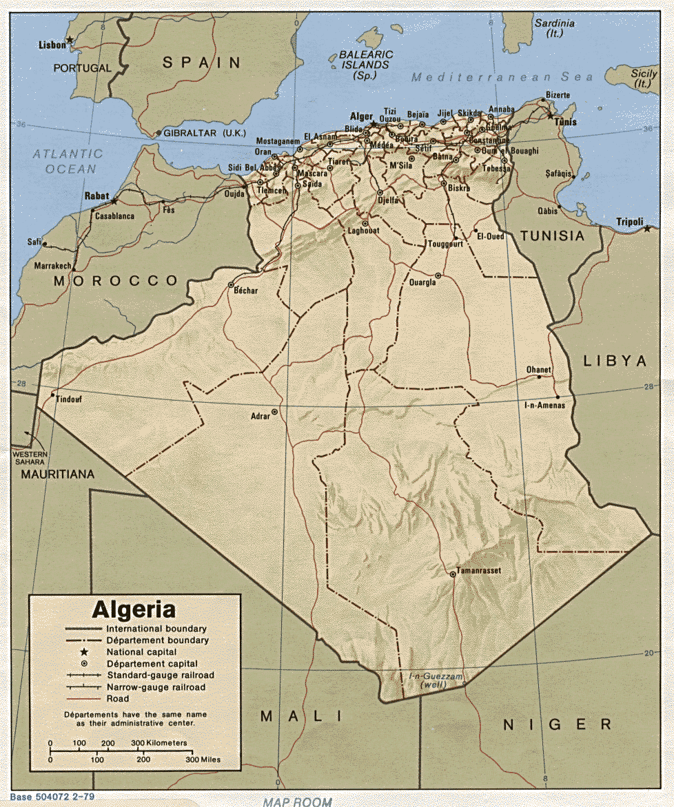
The situation shown in 5-2-A does not require the situation shown in 5- 2-C . But the 5-2-C would be consistent with the 5-2-A, assuming continued growth of the original settlement area (the lower left of 5-2-A). A size-density relation (assuming there is any variation in size to begin with) is consistent with the notion of an earlier process of subdivision in response to changes in population distribution. The data needed to test the size-density hypothesis were available in the Britannica World Atlas, the maps of which had originally led me to wonder about international application of the division model. There is a section of the Atlas, "Geographical Summaries", which gives a variety of statistical information for nations from Aden to Zambia. Part of a typical entry is illustrated in Fig. 5-3, the territorial divisions of Algeria
This shows the size and density for each territorial unit. By inspection, the first département, Alger, has the highest density and the smallest size of any département. Among the regular départements, Saïda has the lowest density and the largest size. Including the Saharan départements, we find still larger sizes together with still lower densities.
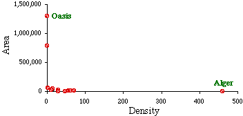
If we attempt to graph the relation between size and density overall, however, as in Fig. 5-4, we encounter a difficulty. The largest of the units, Oasis, is so large that nearly all the others are pushed down along the horizontal axis. It is difficult to observe variation in size, relative to that of the largest unit. By the same token the highest density, that for Alger, is so high that it pushes most of the other dots together near the vertical axis.
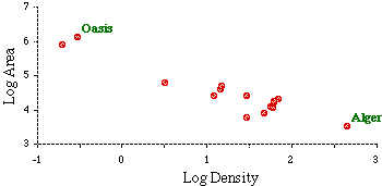
What produces such extremes? The theory says that increasing density should be associated with further subdivision. Yet there is no doubt a lower limit to size beyond which subdivision ceases. If a large region of a country remains unsettled while all the rest is more-or-less settled, we obtain extreme values for size. A related argument can be developed for density. Most regions would show whatever density is "normal" for their country. If one area becomes a focus of migration, attracting more and more population to itself, it would "out-distance" the normal units, resulting in extreme density. This appears to have been the case with the Algerian département containing Algiers, the national capital. One way of reducing the effects of these extreme values is to toss them out of the analysis. While this might make some sense in the case of Algeria's Saharan départements,[3] it is hard to justify throwing out Alger solely because it is highly dense. That, after all, is what the theory is about: variation in size being related to variation in density. We can retain extreme cases without compacting the rest of the distribution by logarithmic transformation [?], as in Fig. 5-5.
Logarithmic transformation produced an observation which I had not originally anticipated[4]: the scatter of data points now formed an approximately straight line. My argument thus far had been only that higher densities ought to be associated with smaller territorial size. The form of the relation had not been specified. It now appeared that the "negative-ness" of the relation could be specified quantitatively, as the slope of a line fitting the scatter of data points.
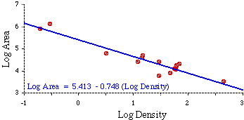
Such a line is shown in Fig. 5-6; its formula was obtained through ordinary least-squares regression analysis[?]. Incidentally, dropping out the two desert départements results in only slightly different values for the intercept and slope (a = 5.217, b = -0.62).
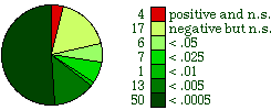
The results of these tests are shown in Table 5-1. This shows the number of divisions in each country (N), the computed slope relating log-size to log-density (b), and the probablity of obtaining a slope that negative, assuming the null hypothesis (β = 0). The tests of significance are summarized in Fig. 5-7. In all but 4 of the 98 nations the slopes were negative, as expected. Among the 94 negative slopes, 78 show departures from the null hypothesis which are statistically significant (p<.05). 50 slopes, over half the total number, were significant at the .0005 level. None of the four positive slopes (Haiti, Italy, Malawi, and Yugoslavia) was significant.
Having established that there was a negative relation between size and density, my interest shifted to "variation in negativity" among the nations. Fig. 5-8 shows that the negative slopes (ignoring the four positive ones) range from Sierra Leone's -1.58 to the practically non- negative -0.09 shared by Netherlands and the United Kingdom. Was this variation of any interest? What did it mean to be very negative, or moderately negative, or hardly negative at all?
I wanted to describe some central value in this range, to distinguish nations which were more negative from those which were less negative. The data for the earlier analysis had been punched on IBM cards, one for each territorial division, the set grouped behind a lead card identifying the nation. I removed the national identifier cards, in effect creating one world with 1,764 territorial divisions. (see, One Worlders? It's just that easy!) The analysis of this set yielded the "world regression line":
log Area = 5.0656 - 0.65 log Density which, with t = -36.5 (completely off the chart for 1762 degrees of freedom), clearly rejected the null hypothesis for the world as a whole. I next intended testing the degree to which individual nations fit this world pattern, but before doing that I modified the world slope somewhat. Though I had computed a value of b = -0.6514, I found myself referring to it as the "-2/3 slope". This was part convenience, part simplicity, part esthetics. I think I also sensed (maybe I'm a closet Pythagorean) that simple ratios (1/2, 2/3, 3/4) tend to be theoretically interesting, though that certainly wasn't my conscious focus at the time. At any rate, I checked the degree to which the world regression line conformed to the simpler -2/3 value: t = 0.855 which, with N = 1764, is practically zero. So everything from here on is with reference to -2/3.[5] Table 5-2 shows the result of two-tailed t-tests of the hypothesis β = -2/3. Two-tailed because nations could be more or less negative than -2/3. Nations are arranged in order, from most positive to most negative slope. As can be seen, many more nations are in agreement with the -2/3 size-density hypothesis than were in agreement with the null hypothesis in table 5-1.
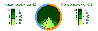
Variation around the -2/3 value is shown in Fig. 5-9. There were 44 nations with slopes more negative than -2/3 (i.e., toward the -1.53 value for Sierra Leone), of which 31 were not significantly different. There were 54 nations with slopes less negative (more toward zero), and of these 34 were not significantly different. Thus, 65 nations show agreement with the -2/3 slope at the .05 level of significance.
Historical Tests of Size-Density The earlier study of county size in the United States had been conducted entirely with maps; no statistics were computed. The international study was conducted entirely from a statistical approach. In an effort to relate the two, to get a sense of the connection, I conducted a statistical analysis of the growth of Oregon counties.
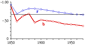
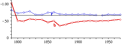
I wanted to do this for the entire United States, but there were not area figures for U.S. counties prior to 1930. Since I had prepared maps for Oregon earlier, by tracing these on fine graph paper I was able to estimate historical county areas by counting millimeter graph squares in each county. (It would only be some time later that I discovered the possibility of measuring areas with a planimeter, rather than counting these tiny squares ... my eyes still ache.) The results of the analysis are shown in Fig. 5- 10. The slope is initially near the -2/3 value shown for the world, but it drifts toward zero generally throughout the period, and steadily from 1900. A parallel study of the states of the United States (shown in Fig. 5-11) showed a tendency to decline below the -2/3 value, but the slope has, in general, been steady since 1800, with a slight tendency to move toward -2/3 since about 1870.
In addition to these, I was examining a map of the British Isles like the shown in Fig. 5-1, speculating about the possibility of size-density relations based on possible size-distance ones. I combined the material in this chapter into a paper titled "Historical and International Tests of the Size-Density Hypothesis", and sent it to the American Sociological Review in July of 1971. The reviewers had two criticisms. First, they said there was too much material in it (odd criticism); they wanted me to throw out everything but the international study. The second criticism (which would pop up often later on) was that the size-density hypothesis was only a tautology, an artifact, since area occurs as both the dependent variable and in the denominator of the independent variable (density = population / area). Large areas have low density by definition . I agreed to limit the scope of the paper, and I submitted a quote which seemed to relieve the editors of the concern over tautology. The quote was from Snedecor's seminal statistics text[6], referring to correlations between variables of the form Y and X/Y:
Having observed some unwarranted interpretations of such correlations, Karl Pearson dubbed them `spurious', and this rather derogatory title has led people to distrust them. Of course, it is the interpretation that may be spurious. The correlations are on the same footing as any others.
This hardly constituted an argument. It was an appeal to authority.
But it satisfied the reviewers and the article
did get published.[7] I suggested at the end of the article,
partly in response to this concern, that future work might use a
different independent variable, "population potential". I take up this
suggestion myself in Chapter 7.
NOTES:
[1]
Britannica World Atlas. London: Encyclopedia Britannica, Inc.
1967.
[2]
Britannica World Atlas. 199.
[3] They are distinctly different from the rest of the
nation. All the other units cluster along the coastline; these two are
largely empty desert regions, stretching off to the south. Their size is
the result of being empty space out to the national boundary.
[4] My original purpose in the logarithmic
transformation was simply to make graphing possible, to get the dots
away from the axes. The mathematical-theoretical significance of the
resulting logarithmic equation came later.
[5] I ignored the intercept in this and most later
studies. The intercept's value is a function of the units in which area
is measured (square kilometers, square miles, acres, hectares, etc.), so
the actual number is more conventional than theoretical.
[6] George Snedecor, Statistical Methods (4th
edition) 162, Ames, Iowa: Iowa State College Press, 1946
[7] G. Edward Stephan, "International
Tests of the
Size-Density Hypothesis," American Sociological Review,
37:365-8.
1972
| ||||||||||||||||||||||||||||||||