CHAPTER 15
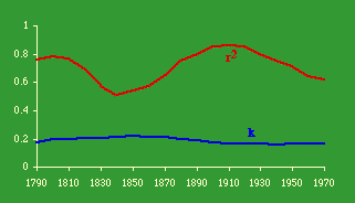
Further Size-Density ResearchFig. 11-3 showed the distribution, by 10° quadrants of the North Atlantic, of birds and the plankton at the base of their food chain.Table 15-1, adapted from my 1970 doctoral dissertation, shows a similar distribution of county seats by 2°. quadrant. In that work I suggested it might be a topic for further research, paralleling the study of animal distributions.[1]
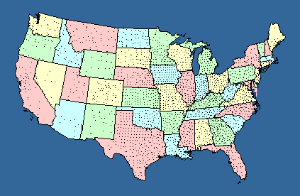
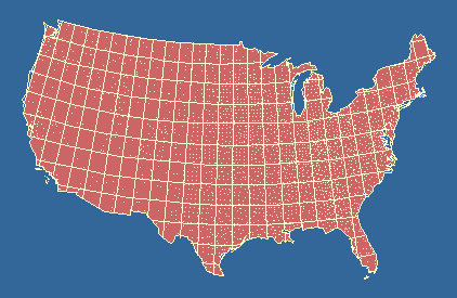
By 1971 I had the latitude and longitude of each county seat.[2] All I needed to complete the data set was to assume that the population of the county could be placed at the same latitude and longitude as its county, a reasonable assumption on this scale. Furthermore, the study could be conducted historically since I had the founding date of each county.[3] All that would be missing would be those few counties which had been created but were no longer in existence (like Umpqua County, Oregon). Again, this wasn't much of problem since the number of counties ever dissolved, though unknown, was probably very small in relation to the 3,000-plus still surviving. What I wanted to do was to get from the usual state- by-state distribution (Fig. 15-1a) to a quadrant-by-quadrant one (Fig. 2-a). It took a decade to get around to it.
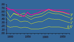
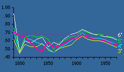
In 1981 Rob Moe, by then a graduate student,[4] was looking for a thesis topic. He took on the geographic quadrants project. Quadrant areas were computed as indicated in Chapter 11. The Demographic Research Lab in our Sociology Department had accumulated all the county populations from 1790 on. So quadrant "county densities" could be regressed against quadrant "population densities." The results are shown in Table 15-2 and Figs. 15-2,3.
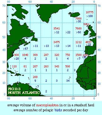
As can be seen, very small quadrants show little change in slopes over time. In fact, small quadrants produce slopes uniformly near zero. The reason for this is that, at an extremely small size, a quadrant has either 1 or 0 county seats. Zero values can't be included in logarithmic transformation, so the number of seats per usable quadrant tends toward a constant. As we increase quadrant size, greater variation becomes possible. By the time we reach quadrants of 2-3° the pattern becomes stable, mirroring the earlier pattern found using states as units of analysis (the pink line in Fig. 15-2,3).
We could, of course go on increasing quadrant size, but the result would only be a return toward zero since, again, there would be little variation in the dependent variable. The ideal size, for our purposes at least, seems to be quadrants of about 3-5°.
These results show that essentially the same methods employed in analyzing predator-prey densities (Chapter 11) can be employed in studying the distribution of a social "species", county governments, in relation to the distribution of its "food supply", the human population which gives it life through taxation (ultimately of its time resources). Perhaps more importantly, they demonstrate that the far easier approach used in earlier studies, with data aggregated into such "artificial" units as nations or states, give virtually identical outcomes. Simultaneously, we have clearly avoided any charge of "tautology" with this approach. A Non-Ratio Test The four equations derived in Chapter 10 were each derived from
In the Summer and Fall of 1983 I supervised thesis research by Dan Dorman which tested the logarithmic form of this equation
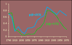
Here we have two independent variables; the obvious test is through multiple regression.[5] The results, computed with P representing the rural population, are shown in Table 15-3 and Figs. 15-4,5 and 6.
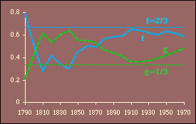
It is evident that these results generally conform to patterns observed earlier. That is, the best theoretical fits are prior to territorial expansion and at the close of the frontier, around the years 1800 and 1900. The multiple correlation coefficient is quite high throughout the period, peaking in 1900 and 1910 and eroding since that time.
One difficulty introduced by this test is the possibility of multicollinearity.[6] High multicollinearity would result in wide confidence intervals for the coefficients and, therefore, a lessened probability of rejecting an erroneous hypothesis. Every year the independent variables are positively related, p{r 2=0}<.05. Whether this represents high multicollinearity is difficult to say, though it may explain why at its highest value (in 1810, r 2=.79) the hypothesis is supported by the probability measures p{f} and p{g} even though their actual values are opposite from expectations (i.e., f, which should equal 2/3, is .27 while g, which should be 1/3, is .61).
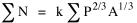
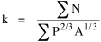
A Test with "Raw Data" In another project with Dan Dorman, we summed both sides of Eq. 10-10
From this we obtained a value for k
producing an expression for N*, the expected value of N, given values for P and A.
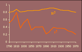
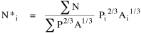
This seemed a fairly severe test — exponents are simply imposed on P and A; and, though k comes from the data, there is no guarantee of error-minimization (as there would be, e.g., with least-squares estimators). We used state rural populations for P; N and A were the number of counties and square miles in the state; results are shown in Table 15-4 and Fig. 15-7.
The value of k doesn't change appreciably, though lower values tend to be associated with the two periods of best fit in earlier tests, around 1800 and again in 1900. The r 2 values show very clear conformity to the earlier pattern.
The results of the non-logarithm, non-regression test and the multivariate test were published together.[7]
NOTES: [1] The Wynne-Edwards map (Fig. 11-3) and Table 15-1 appear on pages 104 and 105 of the dissertation. It is more than an analogy to say that the taxable population provides the food supply for the (predatory? parasitic?) species, county government. [2] Bill Gossman, a Computer Science undergraduate and the son of my good friend and colleague Charles Gossman, had coded the locations of all 3,064 county seats for me as a summer project. [3] from Joseph Nathan Kane, The American Counties (rev. ed.), New York: Scarecrow Press, 1962. [4] As an undergraduate in 1978 he had helped me with the study of city areas (Chapter 9). [5] multiple regression will be covered in the appendix [6] correlation among log P and log A, the presumably "independent" variables (which should be independent of one another). [7] G. Edward Stephan and Dan Dorman, "Testing Size- Density Relationships without Ratio-Variables, Multicollinearity, Logarithmic Transformations, or Regression Analysis." Journal of Regional Science, 25:427-35, 1985. |


