|
Evolution of United States County Boundaries
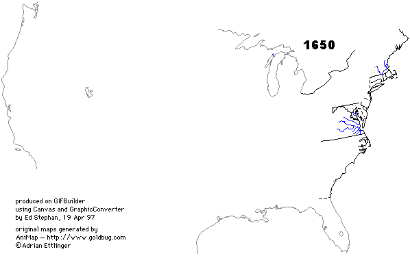
When I was working on my doctorate, in the late 'sixties, I was investigating variation in the size of United States counties. At that time there was little information about the formation of U.S. counties, and I was assured by the Geography Division of the U.S. Census Bureau that very little would ever be found (e.g., there were no nationwide county maps prior to the 1930s). Since then much work has been done in this area. My own research, which has taken me way beyond my early interest in county size, is available on this website in the form of a free, on-line book: The Division of Territory in Society. The most dramatic recent development in this area has been the arrival, on the 'net, of Adrian Ettlinger's AniMap, available through Art Lassagne's Goldbug website. AniMap clearly shows the development of all county boundaries in what is now the United States, from 1634 through 1983. Much of what is now evident through AniMap was sheer speculation when I was working in this area thirty years ago. It is very gratifying to see. I have created an animated GIF showing county boundaries for 1650, 1700, 1750, and census years from 1790 onward. It is too large to embed in a normal html document, so this is just a link to the gif itself. Because of its size it can take a while to load; once cached, however, clicking "reload" will give you quite a show. Use your "return" button to come back. The GIF was made using screen dumps from AniMap on a Gateway 2000 PC, manipulating these in Canvas on a MacPPC, then pasting into GIFbuilder. But I must emphasize, the animated gif — a marvel to me in view of my earlier work with a manual typewriter, Map-o-graph projector and Flair pen — is a very pale and very limited imitation of what AniMap actually does.
|